Showing a Reading Corner Before It Exists with Seedance 3.0

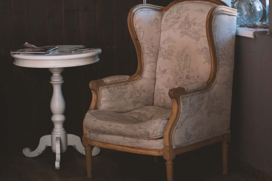
A reading corner is a small interior project, but it can be surprisingly hard to imagine from a shopping list. A chair, lamp, shelf, and rug sound straightforward until their proportions compete for the same patch of floor. For a proposed home design video, I would show the corner as a short sequence of possible views. The film would be labelled as an AI-generated concept, giving the household a way to discuss atmosphere and layout before making decisions.
The starting room would be deliberately ordinary: a window on the left, a shallow wall recess, and enough space for one chair. I would choose a muted green armchair, a narrow oak shelf, and a warm fabric lampshade, a mix that appears in many cozy reading nook ideas. The video would explore how those pieces might feel together. It would not replace measurements, electrical checks, or a real assessment of whether the furniture fits and can be used comfortably.
Decide what the film needs to answer
My first question would be about the experience of entering the corner. Does the chair feel tucked away without looking trapped? The second would concern the relationship between the lamp and the book. The third would be about the view back towards the rest of the room. Those questions suggest a short film with an approach, a seated perspective, and a closing wide view, rather than a room that magically transforms in one continuous shot.
The images for this concept would be developed with seedance 3.0, an AI video generator that supports text-to-video, image-to-video, and reference-based generation using images, clips, and audio. I would provide a measured room sketch and reference photographs of the proposed furniture, then describe the camera path for each view. The sketch would guide composition, while the photographs would establish material and colour.
I would write down the constraints before generating the first clip. The window stays on the left, the shelf remains shallow, and the chair faces slightly towards the room. The lampshade should not block the window in one shot and disappear in the next. These fixed details provide a useful basis for review. Without them, an attractive result can quietly become a different room from the one the household is discussing.
Keep the references consistent with the proposal
The reference pack would contain a room photograph taken in even daylight and separate images of the chair, lamp, and shelf. I would avoid mixing furniture photographs from different colour options. A green chair in one image and a beige version in another can introduce uncertainty that later looks like creative variation. For a design conversation, consistency is usually more useful than surprise.
When working in Seedance 3.0, I would identify which reference controls each part of the scene. The room photograph defines the architectural context, the chair images define the furniture, and a short camera test defines movement. If an audio reference is included, it would provide a quiet domestic atmosphere rather than introduce speech or an unrelated musical style. Each input should have a reason to be there.
I would also keep a plain version of the room sketch beside the generated frames. A model can suggest a convincing space while changing the depth of a recess or widening a doorway. Those changes matter if the film influences a purchase. The real measurements would remain the source of truth, and any scene that visibly contradicts them would be corrected or excluded from the presentation.
Use three viewpoints to tell the spatial story
The approach shot would begin from the room entrance at standing eye level. The camera would move slowly towards the chair and stop before reaching it. I would ask for a steady path rather than an elaborate orbit. The purpose is to show how the corner appears on arrival, including whether the lamp and shelf feel crowded. A simple move makes changes in wall shape or furniture scale easier to detect.
The seated view would be quieter. A book could rest open in the foreground, with the lamp and a small part of the shelf visible beyond it. I would add any readable page content later or keep the pages visually indistinct. In Seedance 3.0, the prompt would concentrate on the light falling across the paper and the relationship between the objects. It would not claim to demonstrate a measured lighting level or eye-comfort benefit.
The closing wide view would place the corner within the larger room. I would leave the rest of the space understated so the new arrangement remains the subject. A slight pullback could reveal the rug edge and walking route, but the film would still be a visual proposal. The household would check actual clearance with a tape measure and, if useful, temporary floor markings before choosing the final furniture positions.
Compare alternatives without changing everything
A second version might test a cream lampshade instead of a darker one. I would keep the camera, chair, shelf, and daylight direction unchanged so the comparison remains meaningful. If every feature changes, viewers may prefer one clip without knowing why. Controlled alternatives help a design discussion focus on a real choice rather than on whichever generation happens to look most cinematic.
My Seedance 3.0 revision notes would describe visible differences: the shelf has become too deep, the chair’s legs changed, or the lamp moved behind the window. I would address those issues before adjusting the mood. An appealing colour grade cannot fix a layout that no longer resembles the proposal. If a scene repeatedly invents architectural details, I would simplify the framing and reduce the amount of room visible in that shot.
Before producing several variants, I would review the current Seedance 3.0 plan options and match the budget to the available clip settings. The allowance would include a few exploratory versions and a separate correction round. I would check the relevant usage terms before sharing the film commercially. A sensible estimate accounts for the clips that will be rejected as well as those that reach the final edit.
Present the concept as a useful conversation
I would assemble the three chosen views into a short video with restrained transitions. A soft room tone or licensed instrumental track could support the mood, but silence should not make the sequence confusing. Captions would identify the proposed materials and any unresolved choices. I would keep product names and dimensions in an accompanying note, where they can be verified and updated without altering the moving images.
The final review would compare the opening and closing frames for continuity, check the vertical crop if one is needed, and make sure the AI-generated label is visible. The household would see the film alongside the measured sketch and furniture references. That combination keeps the visual proposal connected to practical decisions instead of allowing a persuasive image to stand alone as evidence.
A reading corner video does not need a spectacular reveal to be helpful. It needs to show enough of the proposed space for people to discuss where they would sit, what they would see, and which details still need checking. With a small set of consistent references and deliberate camera choices, the film can make an early idea easier to understand while leaving the final decisions grounded in the real room.